Understanding Color Theory
Color theory is a framework that explains how colors interact, how they can be combined, and how they influence emotions and perception. It is an essential foundation in art, design, marketing, photography, and any field that relies on visual communication. By understanding color theory, creators can craft images and compositions that feel balanced, harmonious, and expressive.
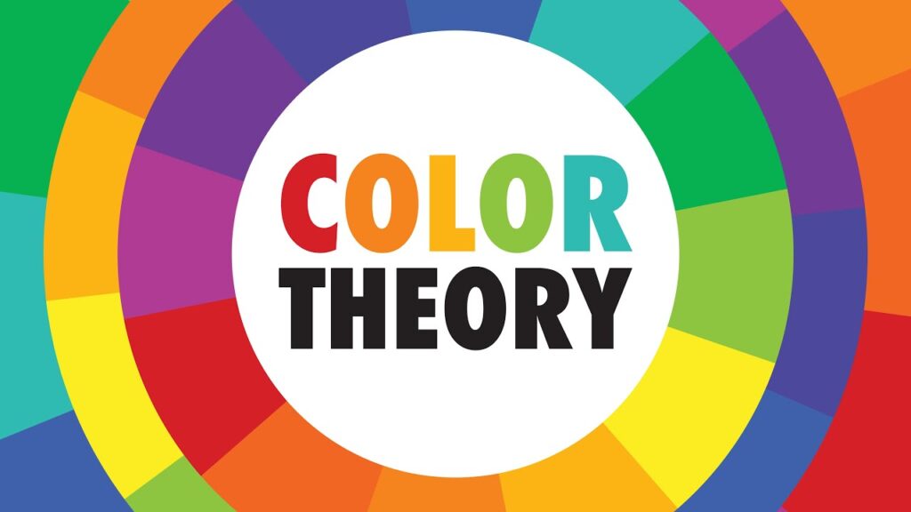
1. The Color Wheel
The modern color wheel is based on three primary colors, three secondary colors, and six tertiary colors.
Primary Colors
- Red
- Blue
- Yellow
These colors cannot be created by mixing other colors.
Secondary Colors
Created by mixing two primary colors.
- Red + Blue = Purple
- Blue + Yellow = Green
- Yellow + Red = Orange
Tertiary Colors
Made by mixing a primary color with a neighboring secondary color.
Examples: red-orange, yellow-green, blue-purple.
The wheel helps artists visualize relationships between colors and select combinations that work well together.
2. Color Harmony
Color harmony refers to pleasing combinations that create balance and cohesiveness.
Complementary Colors
Colors opposite each other on the wheel, such as blue and orange or red and green.
They create strong contrast and a vibrant look.
Analogous Colors
Colors next to each other on the wheel, such as blue, blue-green, and green.
This palette is naturally calm and visually cohesive.
Triadic Colors
Three colors evenly spaced around the wheel, for example red, yellow, and blue.
Triadic schemes are vivid and energetic while still maintaining balance.
Split Complementary
A base color paired with the two colors next to its complementary.
This gives contrast without the intensity of pure complementary opposites.
3. Warm vs Cool Colors
Colors can be grouped by temperature, which influences mood.
Warm Colors
Red, orange, yellow
- Associated with energy, warmth, passion, and intensity.
- They tend to advance visually and grab attention.
Cool Colors
Blue, green, purple
- Associated with calm, peace, sadness, or nature.
- They tend to recede visually and create softness.
Using temperature contrast helps control depth and emotional tone.
4. Value, Saturation, and Hue
Color is not only about the wheel. Three key traits define how a color appears.
Hue
The basic color family, such as red or blue.
Value
How light or dark a color is.
High value means lighter colors, such as pastels.
Low value means darker colors, such as deep navy.
Saturation
How intense or muted a color is.
High saturation colors are bold and vivid.
Low saturation colors feel soft, neutral, or subdued.
Controlling value and saturation is crucial for readability, mood, and focus in a composition.
5. Psychological Effects of Color
Colors influence emotions and decision making, which is why branding and marketing use them strategically.
- Red: urgency, passion, danger, stimulation
- Blue: trust, calm, intelligence
- Yellow: optimism, attention, energy
- Green: growth, nature, safety
- Purple: luxury, mystery, imagination
- Black: power, elegance, seriousness
- White: purity, simplicity, cleanliness
These associations vary across cultures, but many patterns remain consistent.
6. Practical Uses of Color Theory
Art and Illustration
Artists use color harmony, contrast, and temperature to guide the viewer's eye and build emotion.
Graphic Design
Designers rely on color psychology and balance to create strong branding and readable layouts.
Interior Design
Color temperature and saturation help define space, mood, and atmosphere.
Film and Photography
Color grading shapes tone, depth, and storytelling.